Now, let us examine three types of data that we encounter in our day-to-day lives and what is the best way to represent it and why.
Banking Account Summary:
Everyone owns a banking account and often we like to check our account details especially the summary of the credit and debits each month. Here the information and numbers matter the most. The account holder needs to see every bit of information available. Hence, a tabular representation of the data will be most effective. This gives all the details in an exhaustive fashion.
Below is the representation of the account summary from one of the banks online:
Although I agree with this representation I would like it to be modified a little so that I can drill down on the either the credits or debits for the month and categorize the various expenses and group them for my understanding.
Telephone Bills:
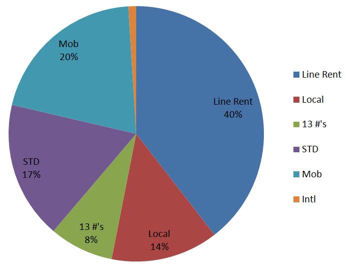
A classic example of large data in our day to day lives is our mobile phone bills. An individual need not know every data point in the phone bill but needs to know how the split up has been and the spikes (if there were any calls that cost more money than the rest). But the usual representation of the phone bills is as follows:
The above is very difficult to read and it is more difficult to draw conclusions from it. Hence I suggest pie charts to break up the total bill by its components and the usage of bar graphs to represent the number of hours on calling a particular number and the associated money spent. Below is an example of the pie chart.
FitBit Data:
Fitbit is a device that helps a person stay fit by tracking the number of steps a person takes everyday, the number of hours of sleep and even their dietary intake. Fitbit has become a common gadget among people who are health conscious. Fitbit also lets friends and family compete with one another regarding the number of steps and the calories burnt.
An amazing feature of fitbit is its dashboard. It is highly colorful and very easy to read with many graphs. I wanted to include fitbit in this discussion mainly to highlight how technologies can use BI tools to visually represent their data in a readable format.
Conclusion:
Many of the old organizations are trying to re-evaluate how to represent their data. for some organizations like banks, the usual tabular representation works but for others like telephone companies, it does not work. Also the new organizations like fitbit have adopted the visualization of data and have taken it to new heights. Thus organizations should reconsider what is the right way to represent the data for their customers and incorporate more visualization in the future.
References:


No comments:
Post a Comment